Mei Ran Yeon, a skincare brand, focuses on elegance, natural beauty, and sophistication. The branding project aimed to communicate the brand's unique philosophy: "Elegant Blossoms, Born for Beauty" through a carefully curated logo and visual identity. By blending cultural symbolism with modern aesthetics, the brand establishes itself as both timeless and relevant in the competitive skincare industry.
Objective
To create a visually distinct and memorable brand identity that reflects the essence of femininity, natural beauty, and modernity.
My Role
Deliverables
The logo design integrates three core elements: the Chinese character “美” (beauty), a butterfly, and the silhouette of a woman. These elements symbolize elegance, nature, and the brand’s distinct identity:
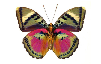
Butterfly
Represents transformation and natural beauty.

Silhouette of a Woman
Embodies elegance and sophistication.
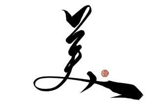
Chinese Character “美”
Grounds the brand in its cultural heritage.
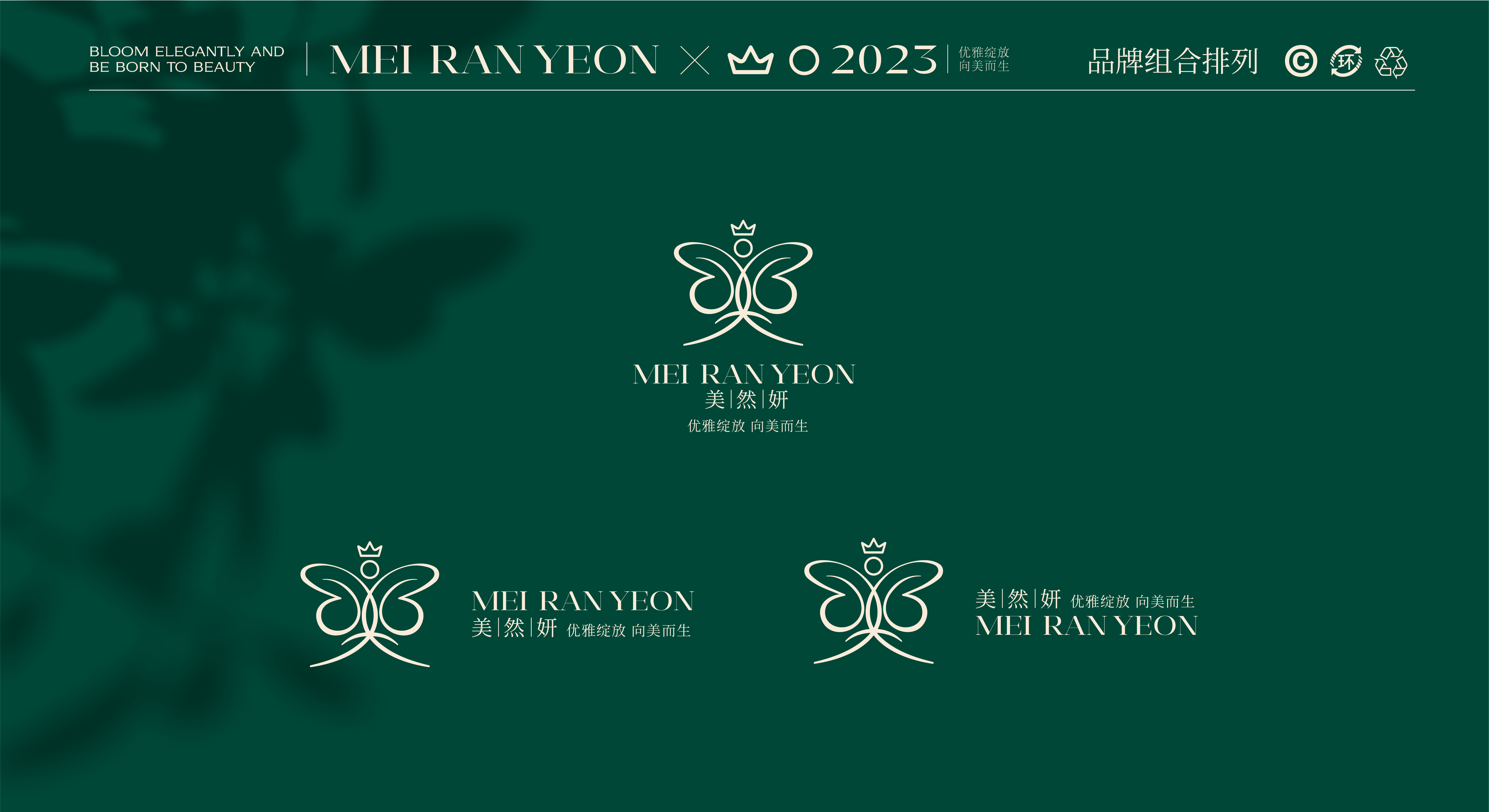
The Mei Ran Yeon logo incorporates three primary elements, each with distinct symbolic meanings:
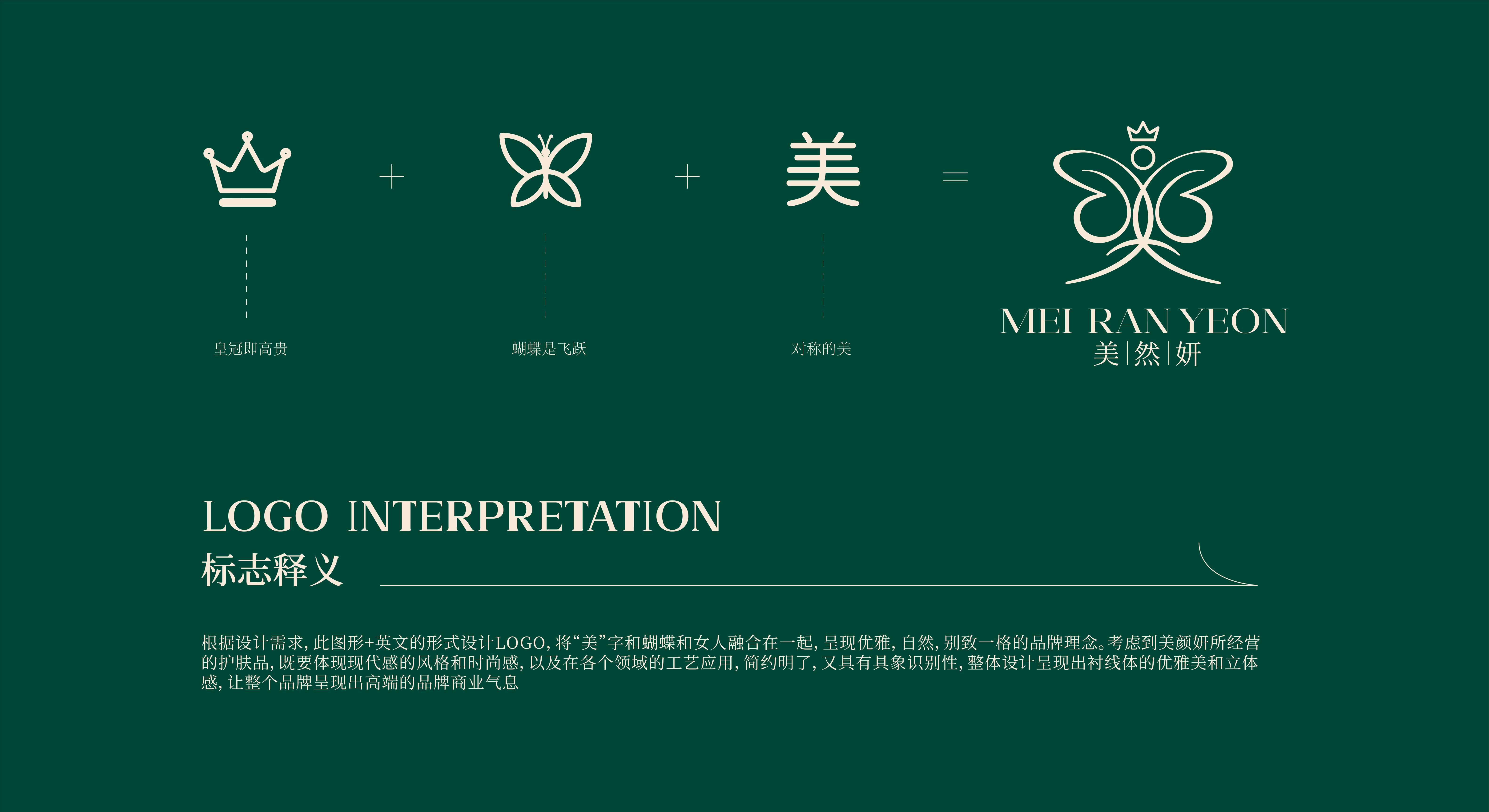
Crown
Butterfly
"美" (Beauty)
Conceptual Approach
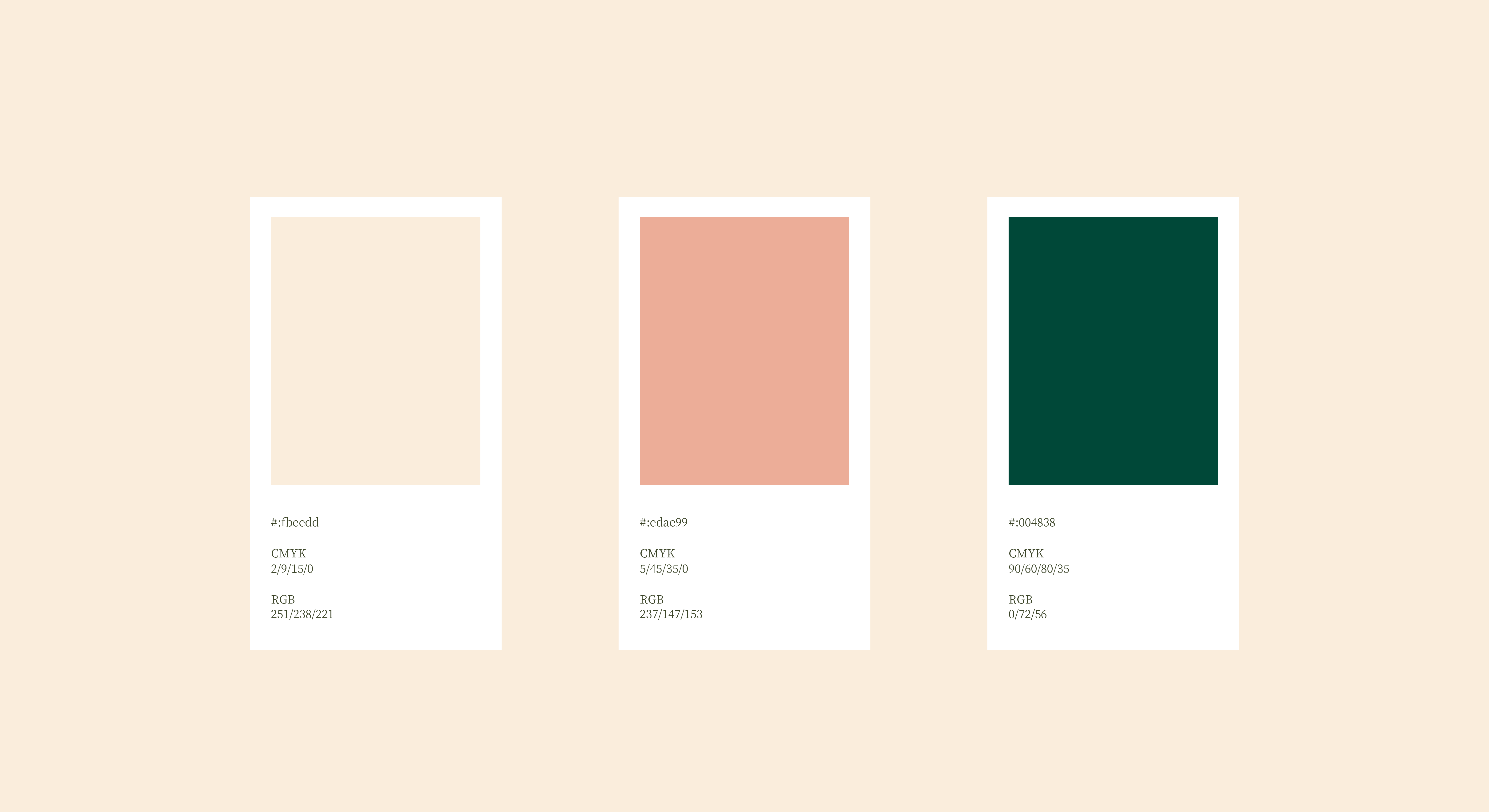
The brand uses a harmonious combination of colors that align with its skincare focus:
This color scheme creates a soothing and premium visual experience, resonating with the target audience.
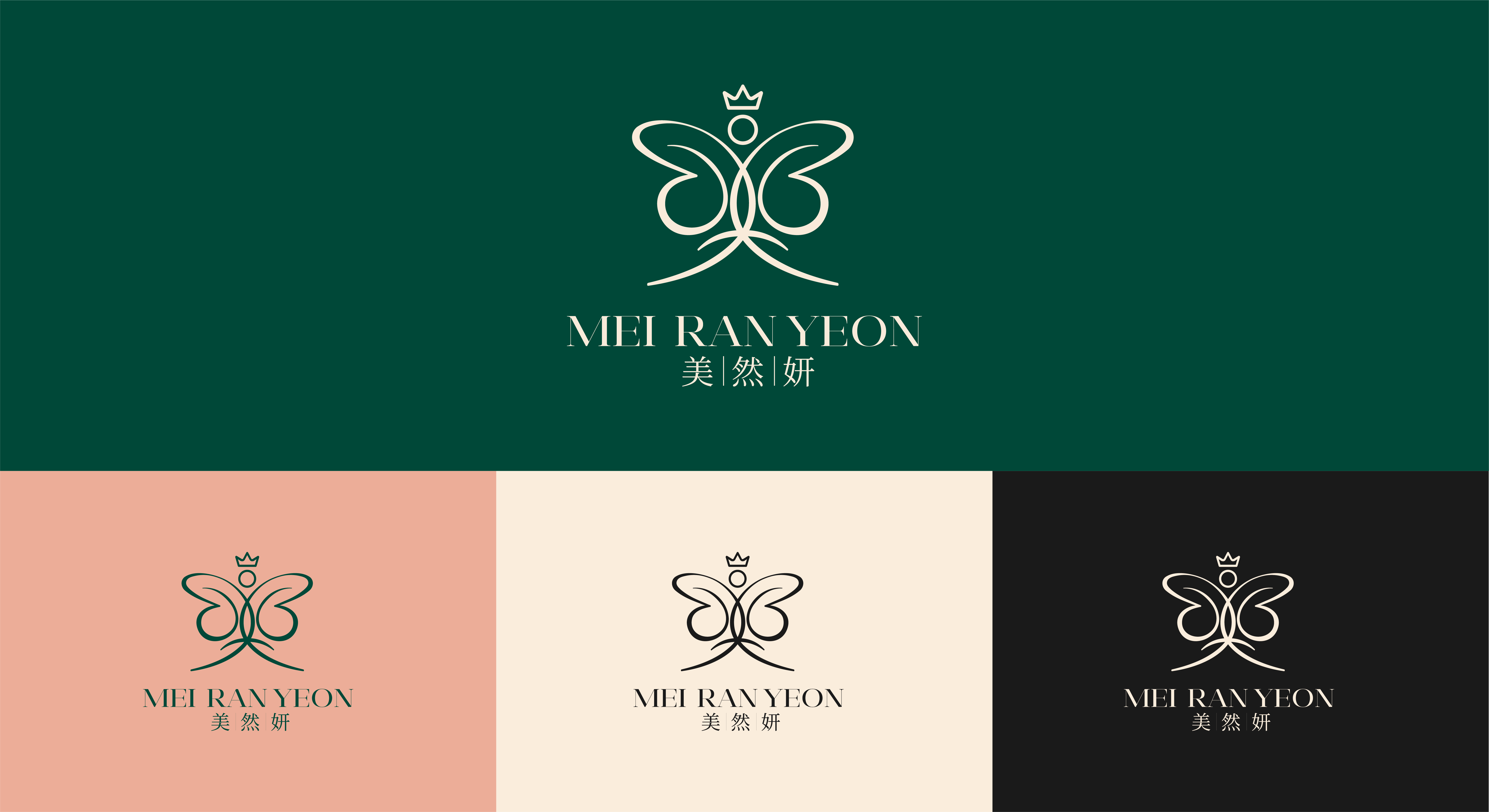
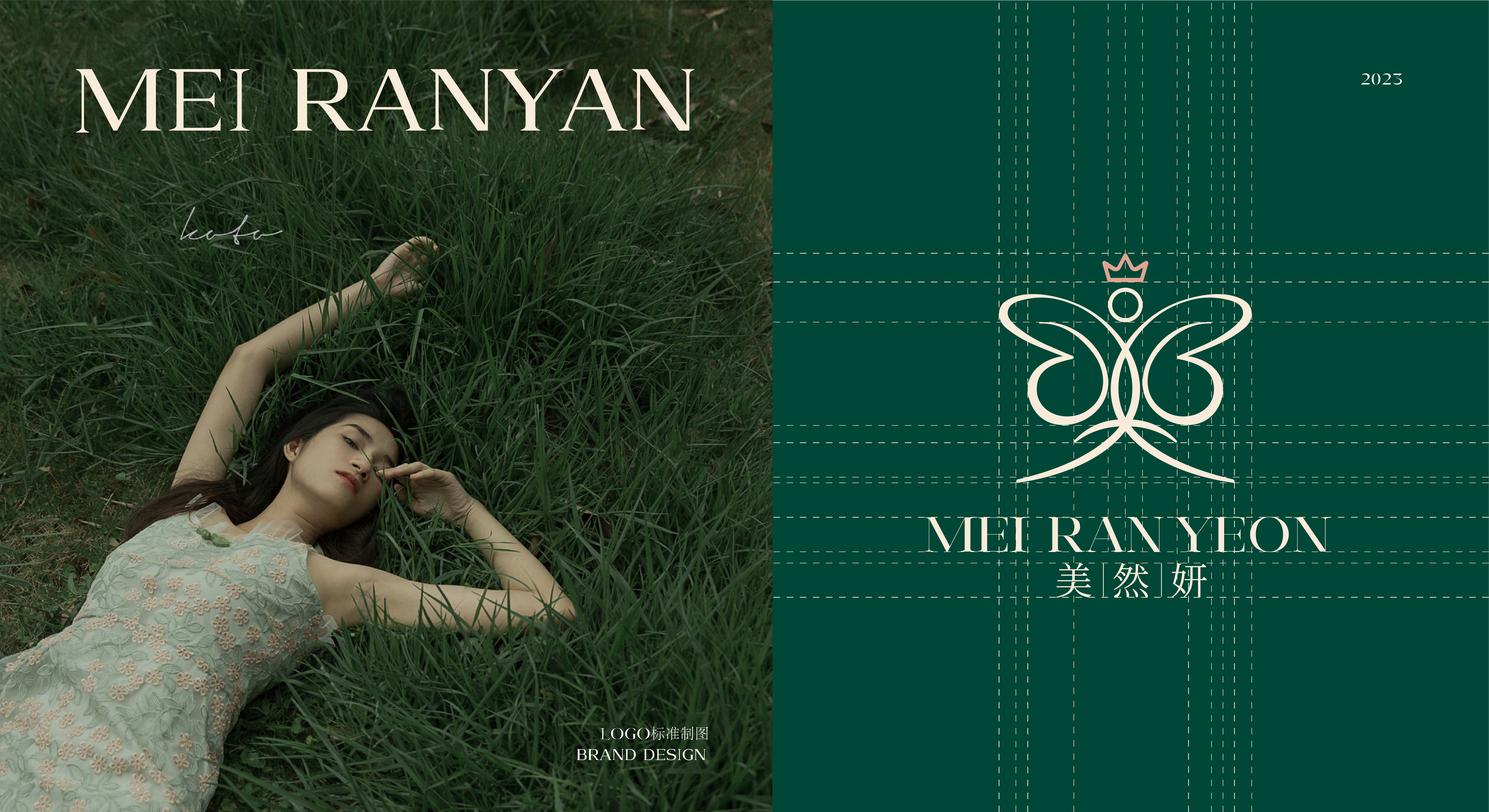
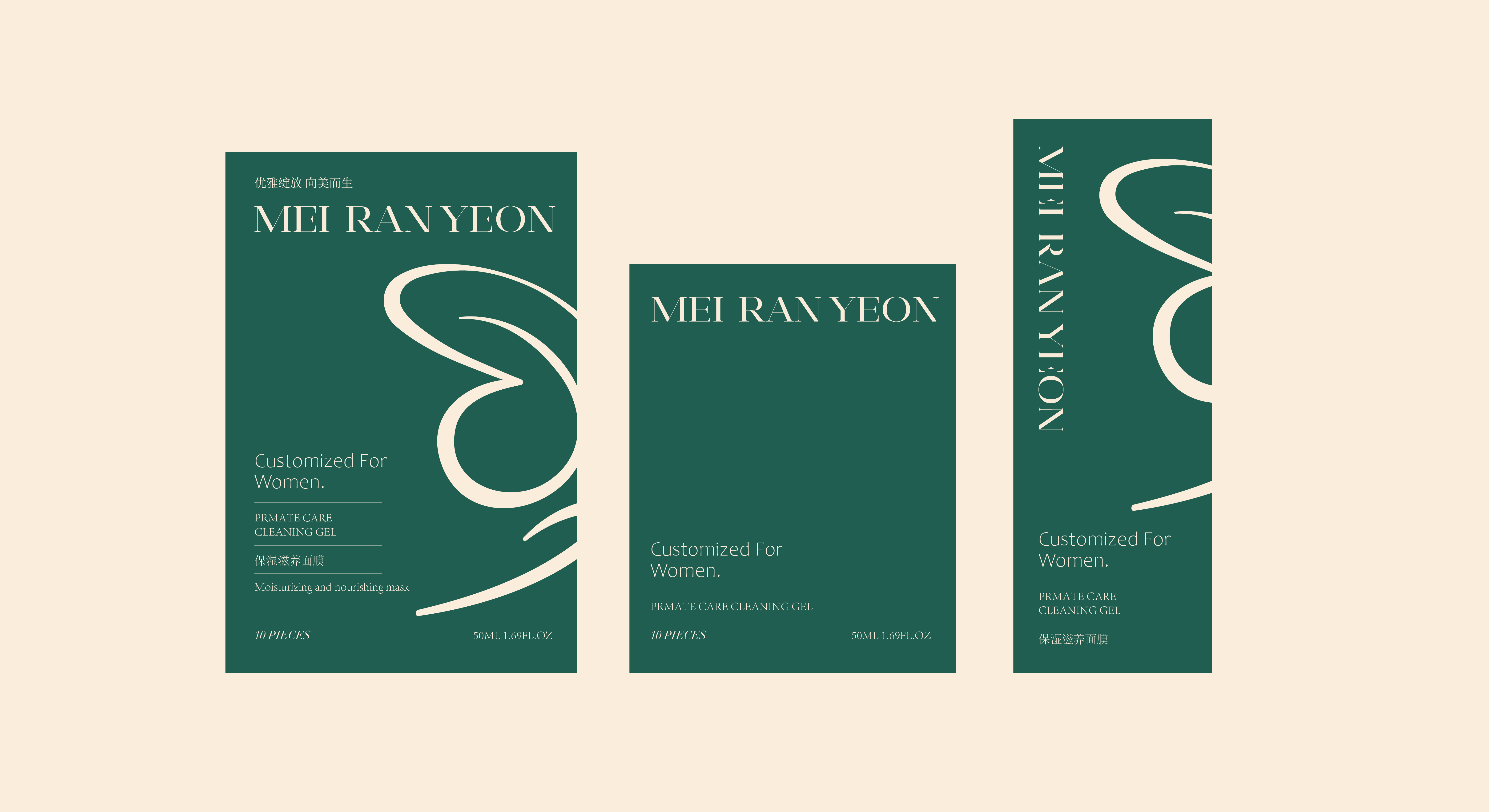
The overall visual identity was designed to be simple, elegant, and recognizable. The integration of symmetrical patterns and minimalist layouts enhances the brand's premium appeal.
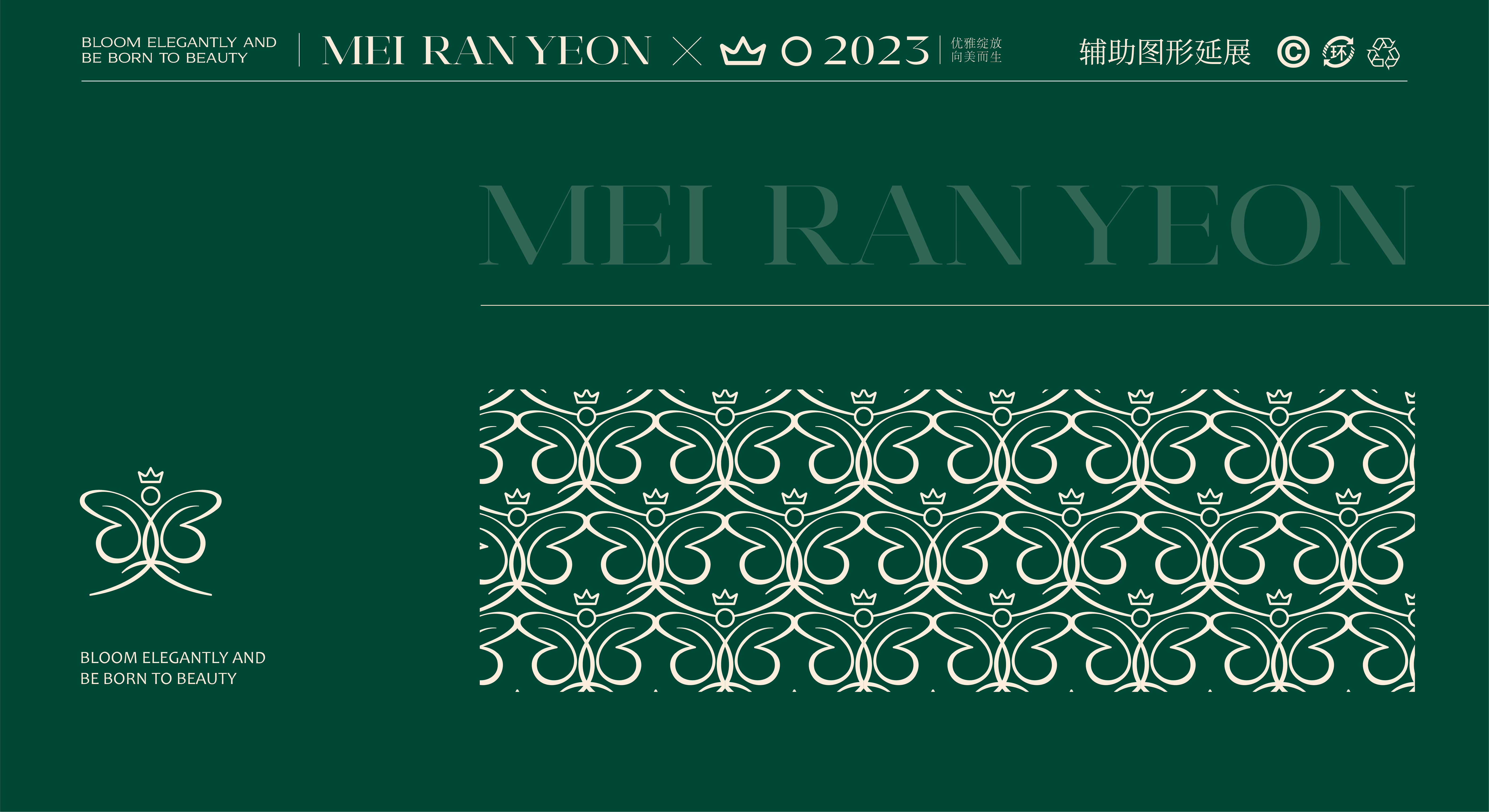
Pattern Design
Custom floral and butterfly patterns inspired by the logo, used across packaging and promotional materials.
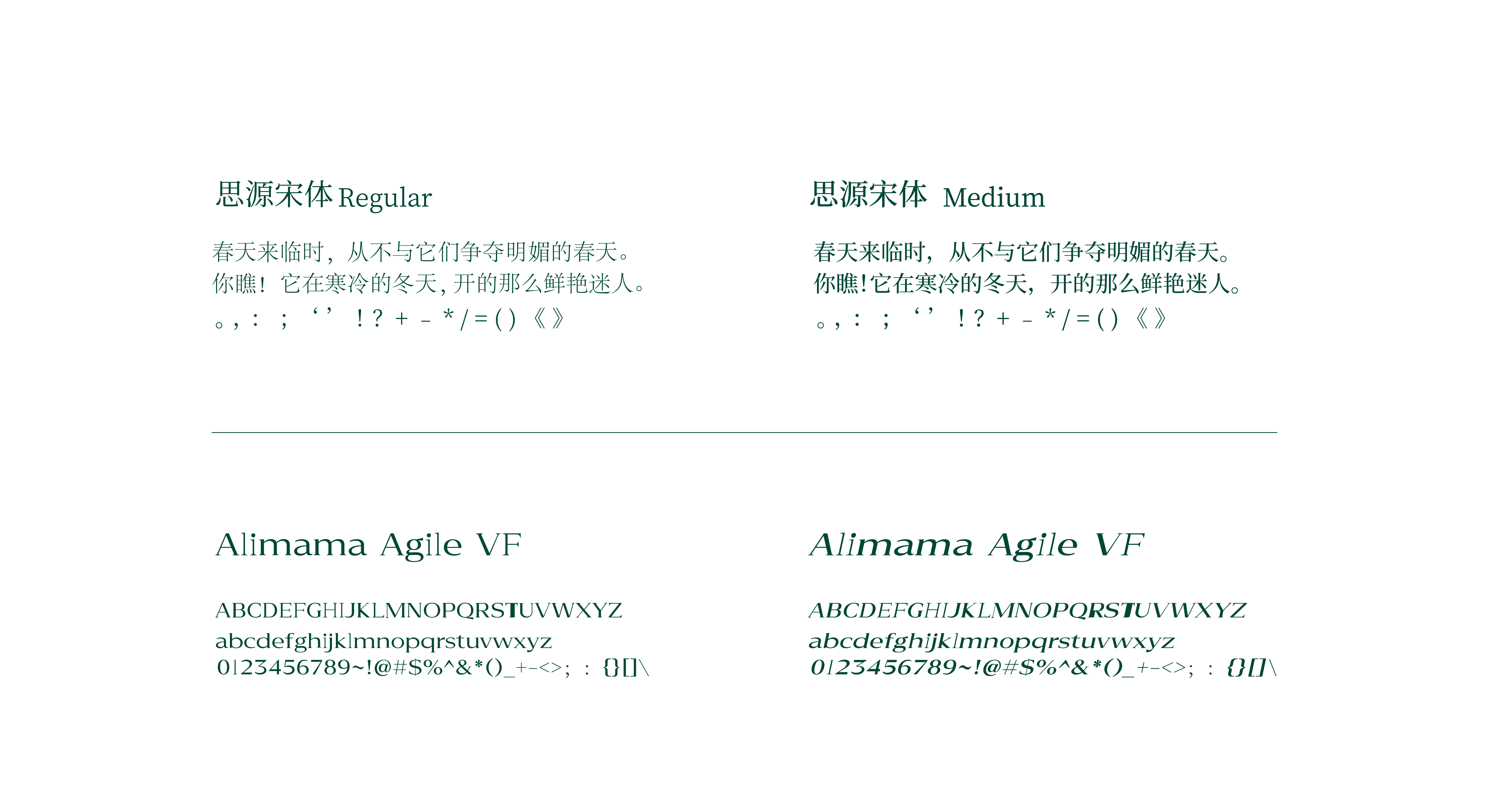
Typography Application
Serif fonts used strategically for brand messaging and sans-serif fonts for secondary information.
Seamlessly Translating Identity into Touchpoints.
The carefully crafted Mei Ran Yeon branding is thoughtfully applied across multiple platforms and
materials to ensure a consistent and immersive brand experience. Below are the detailed applications:
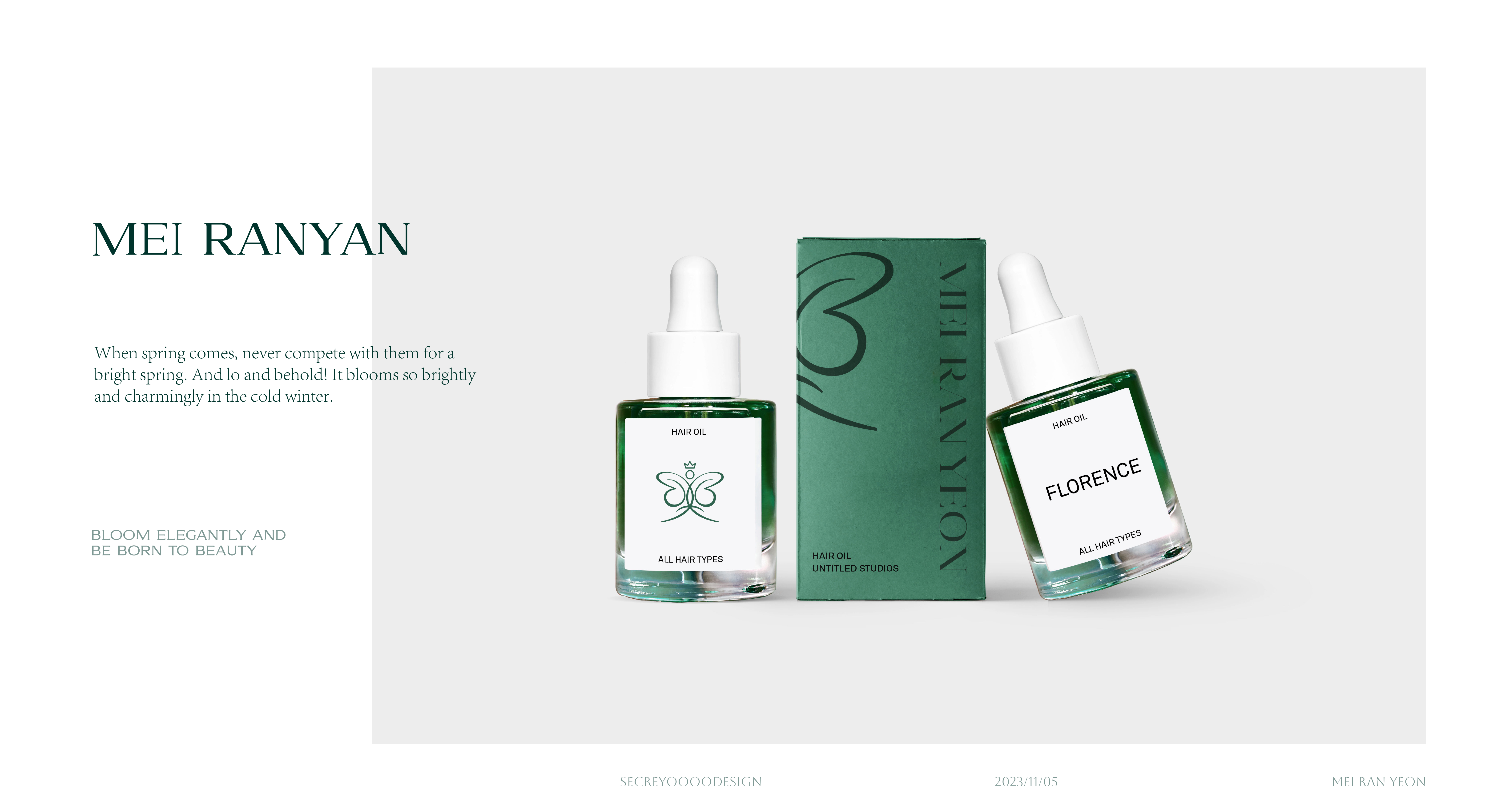
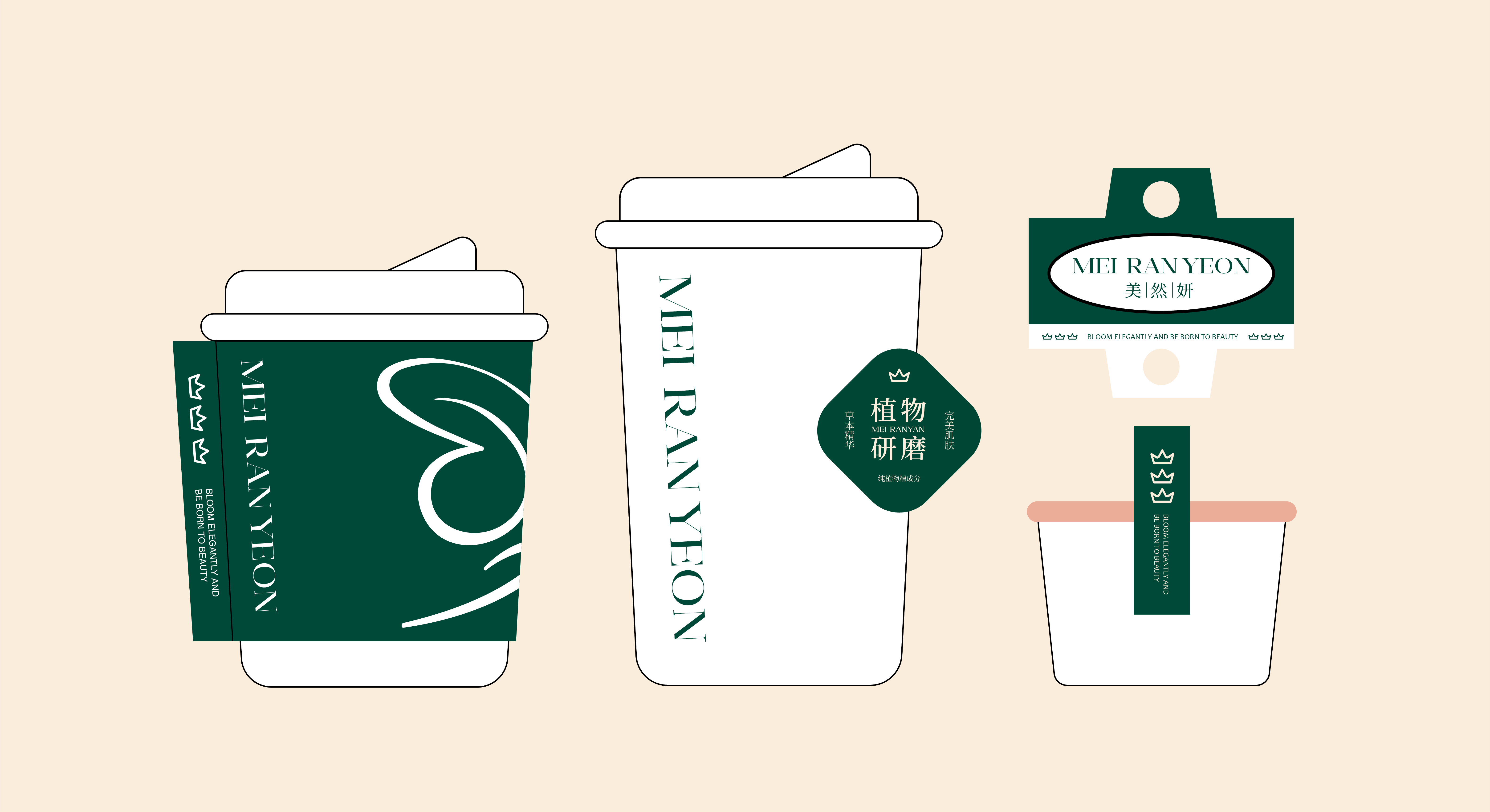
Product Packaging
Design Philosophy:
Reflects luxury, sustainability, and elegance while highlighting natural beauty.
Features:
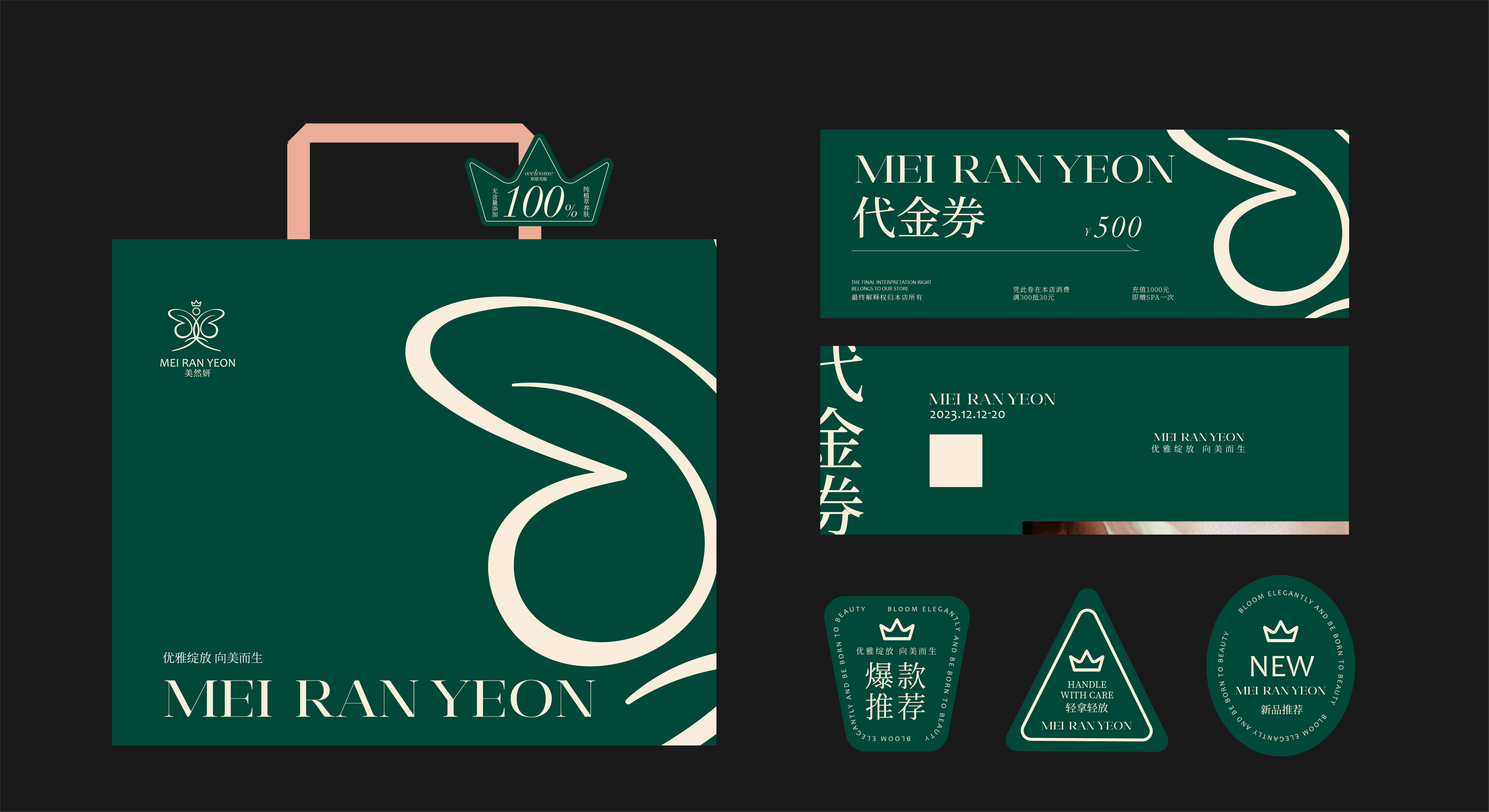
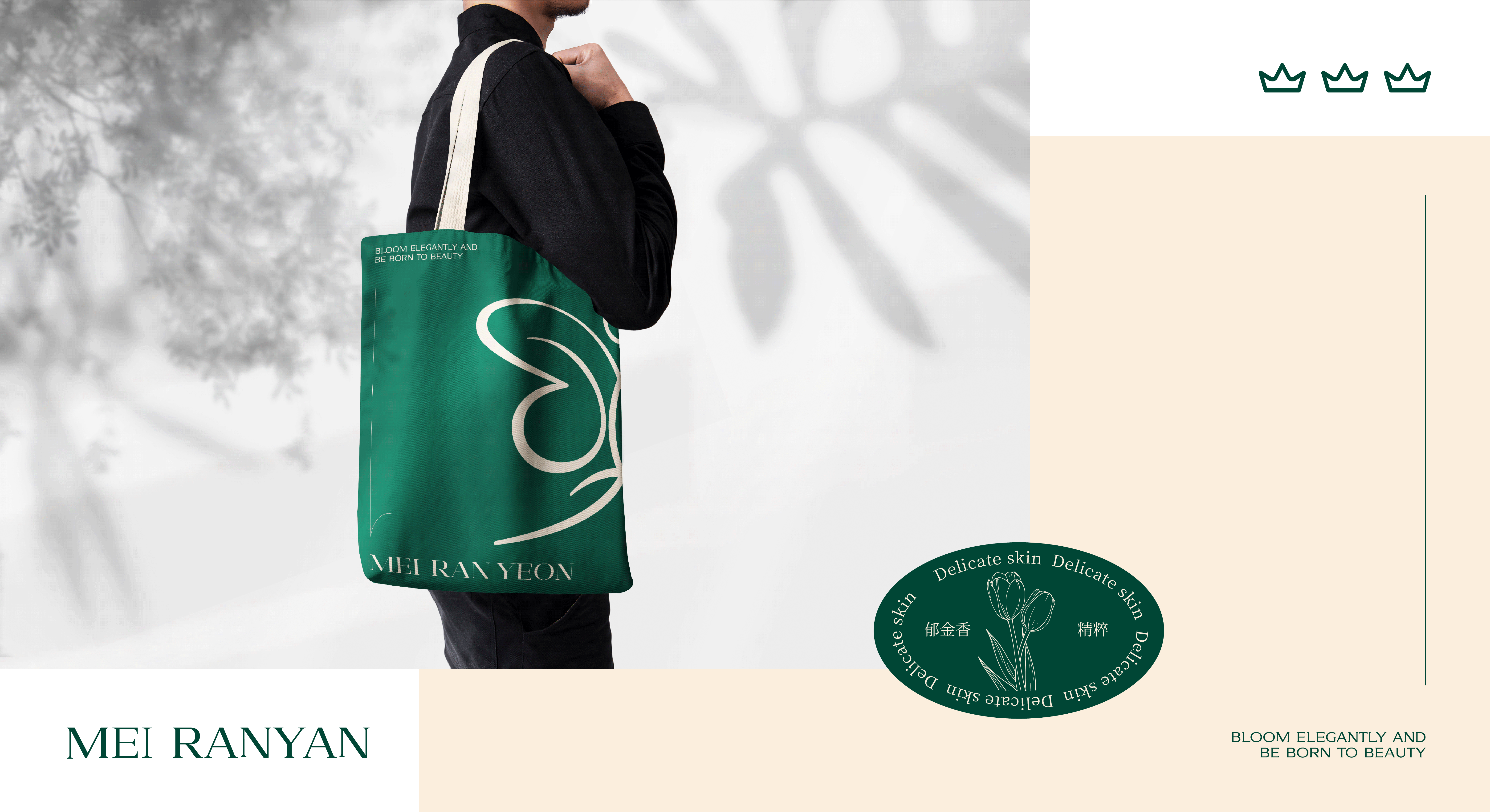
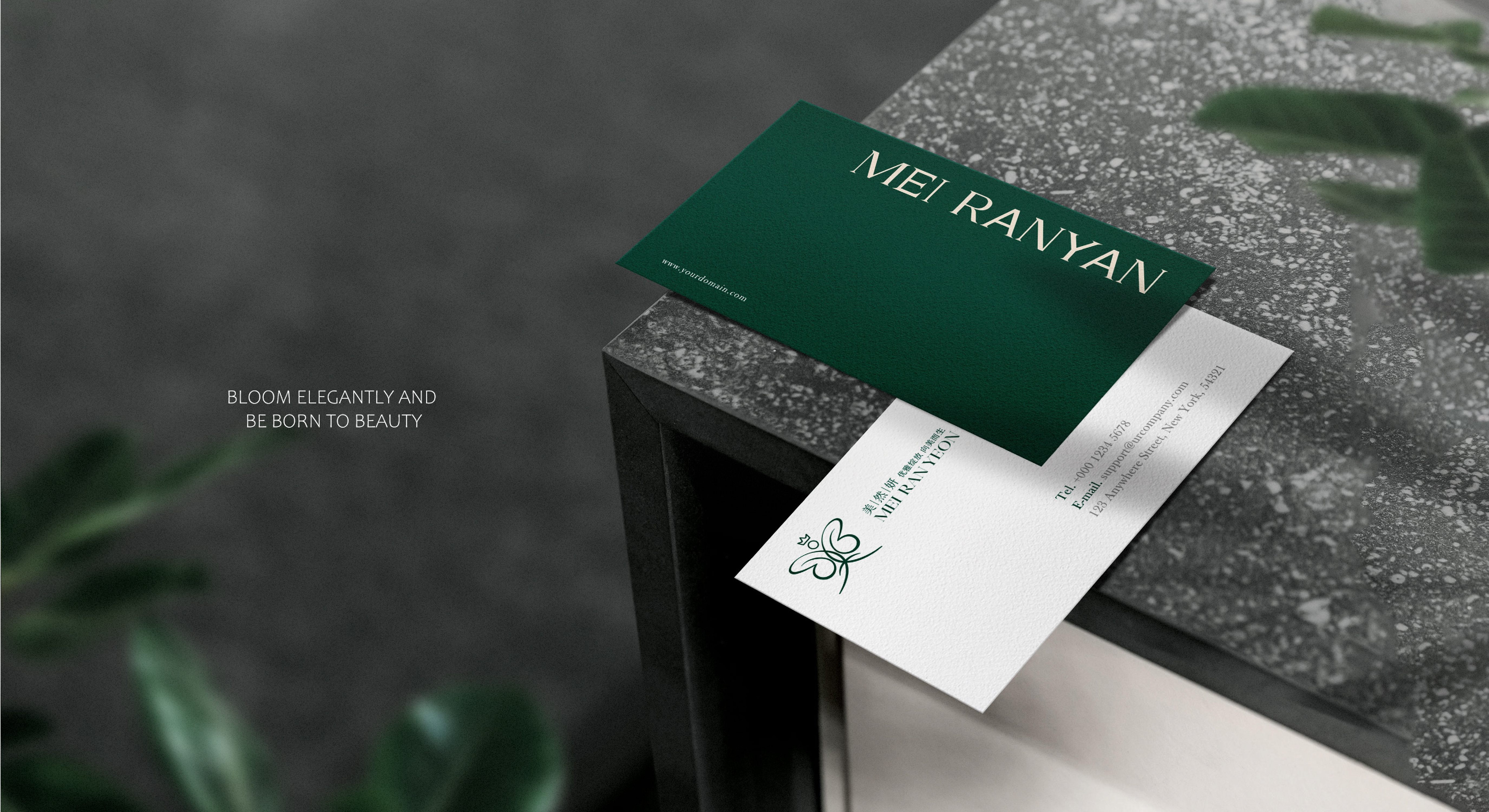
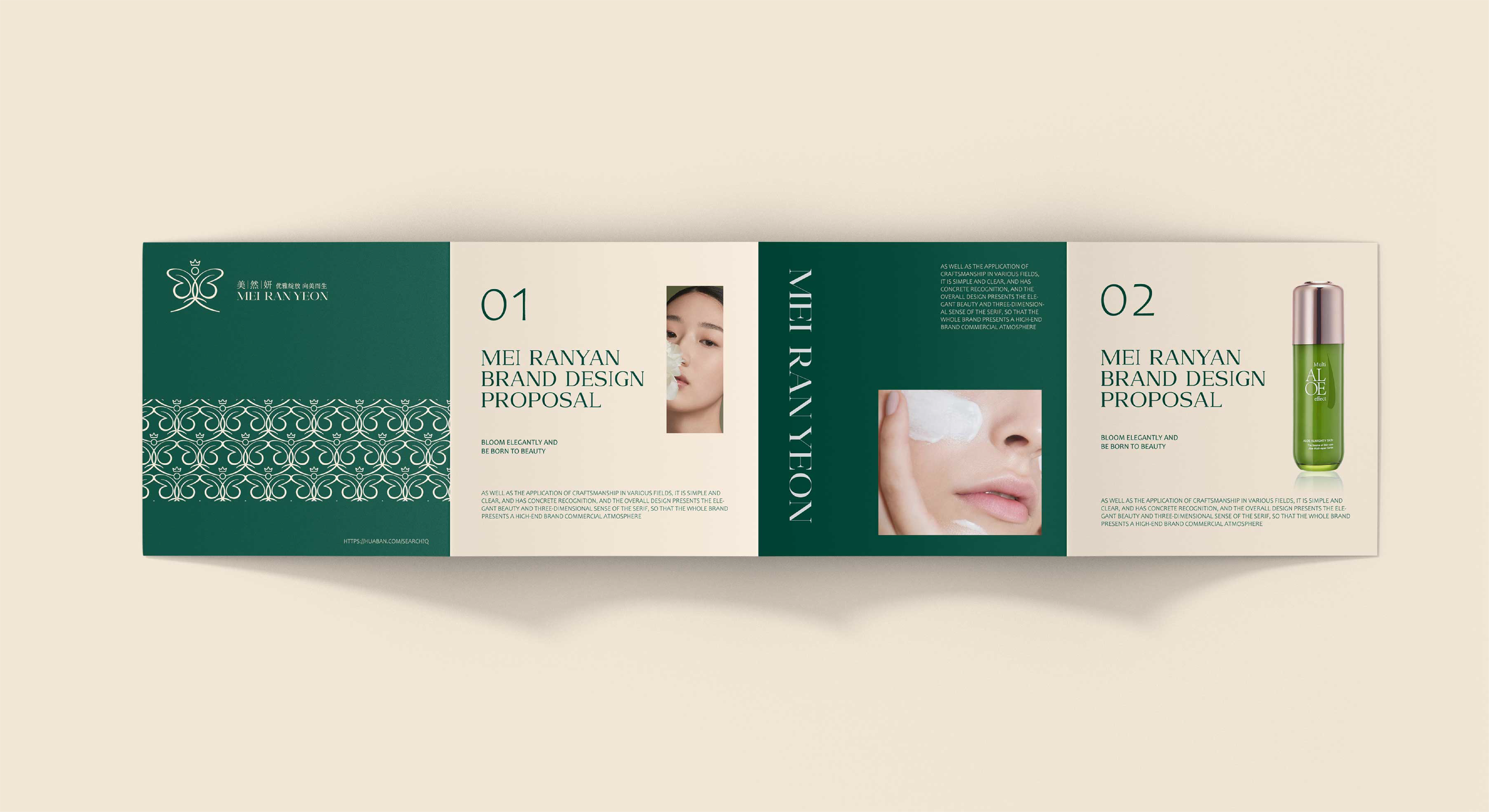
Marketing Collateral
Business Cards:
Brochures:
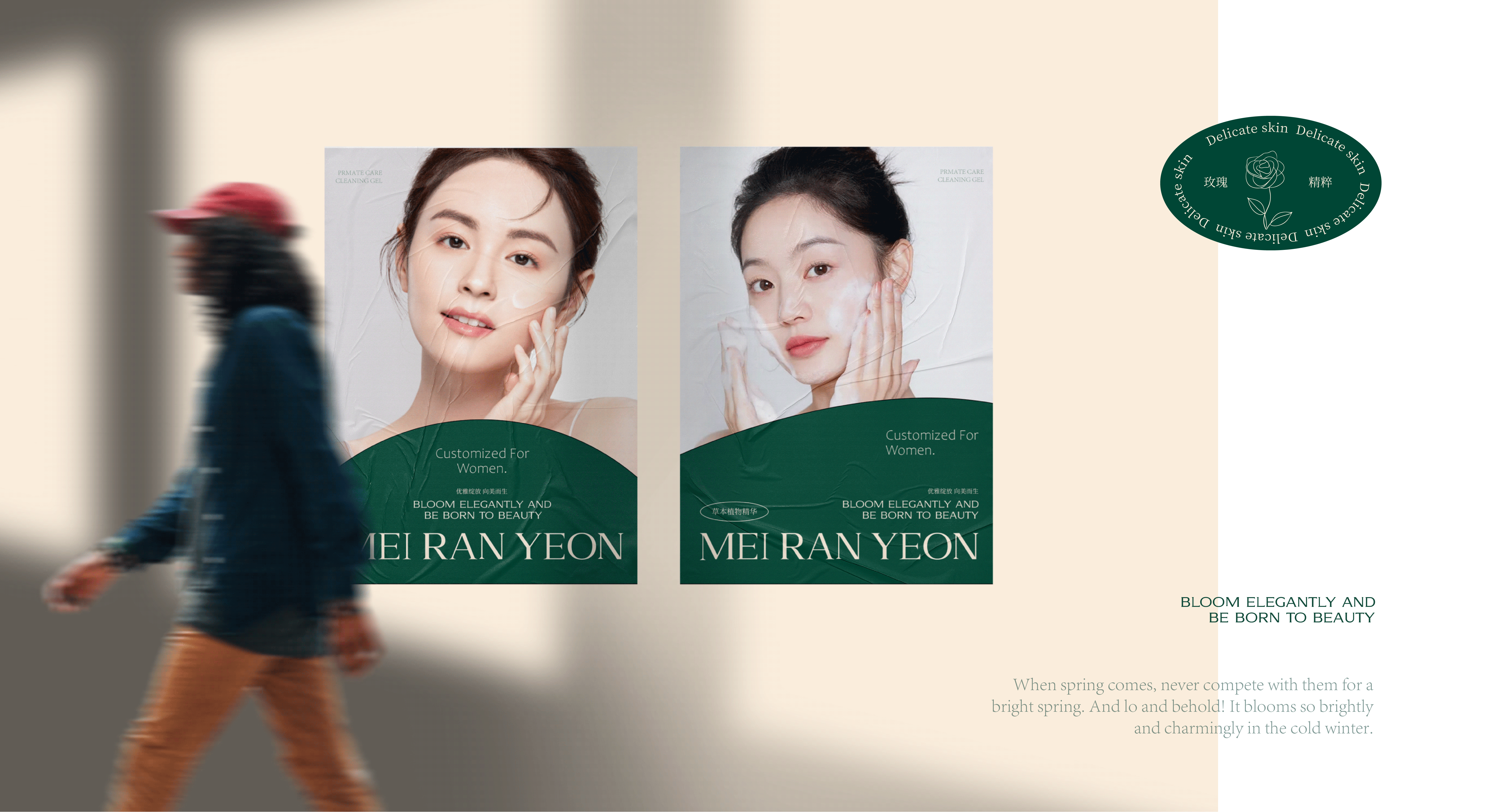
Banners & Posters:
Challenge 1
Balancing cultural symbolism with modern trends.
Solution: Incorporating traditional elements like the butterfly and Chinese character into a contemporary, minimalistic design.
Challenge 2
Ensuring strong visual recognition across multiple mediums.
Solution: Created versatile logo variations and scalable design elements.
The Mei Ran Yeon branding project successfully positions the brand as a premium, modern, and culturally authentic skincare brand. The brand identity:
The Mei Ran Yeon branding project exemplifies how thoughtful design can encapsulate a brand’s philosophy while appealing to its target audience. By combining elegance, natural beauty, and modern aesthetics, the brand sets a new standard for premium skincare identity.